Red Hot Roadtrip: Fan Experience Design
Red Hot Roadtrip: Fan Experience Design
Red Hot Roadtrip is a fictional campaign concept designed to bring fans into the world of an imagined Red Hot Chili Peppers summer tour. Rooted in nostalgia, Californian culture, and the gritty charm of life on the road, the project explores how visual design can deepen fan connection through storytelling and tactile experience.
The campaign includes a physical fan welcome package, branded tour visuals, and collectible ephemera inspired by 90s road culture. Items include cassette tapes, motel keychains, a handwritten postcard from the band, a custom tour map, and a fan scrapbook designed to be filled in throughout the journey. The project also features a series of original posters created to promote the tour and expand the visual identity of the campaign.
Red Hot Roadtrip transforms music into memory and design into a shared adventure between artist and fan.
Creative Direction and Visual Design
The visual identity of Red Hot Roadtrip is rooted in a DIY, sun-drenched aesthetic that blends elements of 90s tour culture, skate photography, and analog nostalgia. The creative direction captures the raw, restless energy of the Red Hot Chili Peppers while reimagining how that spirit could be translated into a fan experience.
Inspired by worn-out mixtapes, overexposed polaroids, motel signage, and desert roadside ephemera, I developed a cohesive design language that feels intimate, spontaneous, and memory-driven. The aim was to create a world that feels personal, like something a fan might collect over time while on the road.
Hand-drawn textures, film grain overlays, and washed-out color palettes are used across posters, packaging, and printed materials to evoke a heat-soaked, analog feel. The fan scrapbook is designed as an interactive piece that encourages fans to document their own journey and become part of the story. Throughout the project, I focused on blending storytelling with tactile design to create a nostalgic yet immersive fan experience.

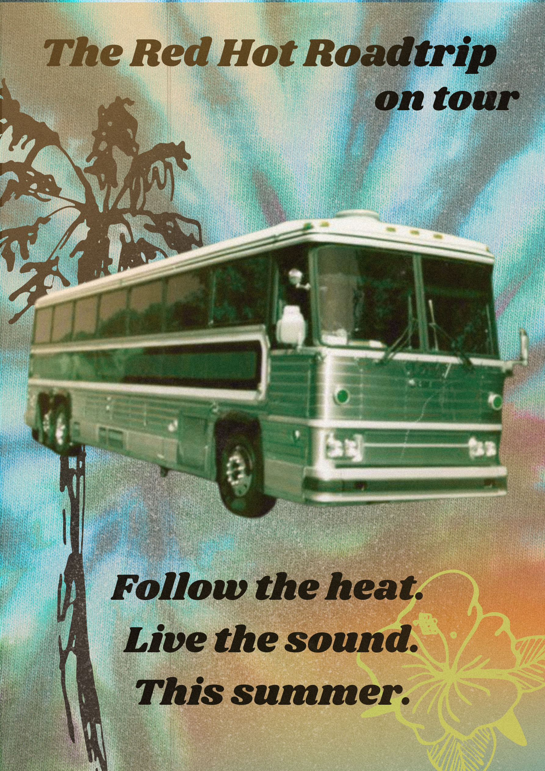
The Red Hot Road-trip Campaign


Visual Identity - Behind the Poster Design
This poster series captures the energy of the Red Hot Chili Peppers on tour through bold summer colors, retro textures, and a classic tour bus as the central visual. Inspired by 70s band posters and road trip nostalgia, each version plays with different backdrops to reflect the changing moods of the journey.
The consistent layout creates a collectible feel while the backgrounds shift from warm gradients to psychedelic bursts. Designed to feel like something fans would grab off a venue wall or keep in a scrapbook, each poster blends vintage charm with tour excitement.

Miles of Magic: The RHCP Tour Diary
-
![]()
Miles of Magic was designed as more than just a fan collectible. It’s a living, breathing scrapbook for those lucky enough to follow the Red Hot Chili Peppers on tour. This tour diary becomes part of the experience itself, something fans receive at the start of the journey and carry with them, page by page, city by city.
-
![]()
The creative approach was inspired by the messy sun-drenched magic of road life. From taped polaroids and torn paper textures to handwritten notes and dried flowers, every element is built to feel personal and handmade. It mimics the kind of journal you'd keep on a road trip with your best friends, full of sketches, setlists, diner stops, and memories too good to forget.
-
![]()
Visually, the diary blends the grit of vintage tour culture with playful youthfulness. It invites fans to document their own stories, morning coffee with the band, secret gigs, roadside chats, and fill the pages with real-life moments that feel like scenes from a movie.
-
![]()
More than a design piece, Miles of Magic is a co-created keepsake between the band and their fans. A space for connection, creativity, and memory making on the road.
-
![]()
The diary also includes blank pages and prompts for fans to make it their own. Whether it’s sketching a concert moment, writing a late-night journal entry, or pressing a flower from a roadside stop, there’s space to create and reflect throughout the trip.


